Minimalist web design focuses on the essentials: clear structures, ample white space, and a deliberate use of colors, typography, and images. By consciously omitting unnecessary elements, a clean, uncluttered website is created that guides the visitor’s gaze. A minimalist design builds trust because it conveys clarity, order, and modernity. This helps users find what they’re looking for faster—and stay on the site longer. This design philosophy embodies a conscious “less” that ultimately leads to “more” in terms of impact, focus, and user satisfaction.
Why Less Is Often More
Minimalism is not a limitation, but a choice to focus on the essentials. When distractions are reduced, content and messages come to the forefront. “Less” here does not mean “empty,” but rather “clearly structured.” A harmonious layout, ample white space, and a deliberate color scheme create room for what matters: the user experience.
- Better user guidance: Visitors find their way around more quickly because they are intuitively guided through the content.
- Focus on content: Important messages are communicated clearly and precisely, without visual distractions.
- Faster loading times: Fewer graphics and scripts reduce loading time—a plus for SEO and user-friendliness.
- Professional impression: A clean, uncluttered design comes across as modern, trustworthy, and competent.
Best Practices for Minimalist Web Design
1. Use white space effectively
White space is not unused space, but a central design element. It creates balance, calm, and readability. Well-placed spacing between text, images, and modules guides the user’s gaze and enhances understanding of the content. Too little spacing, on the other hand, can appear cluttered and strain the eyes. A good minimalist design therefore thrives on the deliberate empty space between elements.
2. Limit the color palette
A limited color palette is a hallmark of minimalist design. Use no more than two or three primary colors that align with your brand identity. Color should always serve a purpose—such as drawing attention or evoking emotions. Background colors should be subtle and harmonious, while accent colors should specifically highlight important elements.
3. Design clear typography
Typography is the backbone of readability. A clear, highly legible font conveys professionalism and structure. The ideal approach is to combine a main font for body text with an accent or headline font. Avoid using too many different fonts—they disrupt consistency. Generous line spacing and contrast also ensure a pleasant reading experience, especially on mobile devices.
4. Reduce Unnecessary Elements
Every element on a website should serve a purpose. If an icon, graphic, or animation doesn’t offer clear added value, it should be removed. This keeps the focus on content and user guidance. Minimalism, then, is not a trend, but a conscious choice in favor of functionality and elegance. However, animation effects can be used strategically to promote interactivity—but they should be subtle, not dominant.
5. Prioritize Content
Important information belongs at the top. Users scan pages quickly—so the most important information must be immediately visible. Secondary content or detailed information can be moved to subpages or made accessible via expandable sections. This keeps the page uncluttered, and the user doesn’t feel overwhelmed. A clear content strategy is the key to success here.
Avoid Common Mistakes
A minimalist design leaves no room for carelessness. Too much white space without structure looks empty and disjointed, while too little spacing makes the page feel cramped. Unclear navigation or too many fonts disrupt the harmonious overall look. Every decision—whether regarding color, spacing, or typography—should be made intentionally.
- Too much white space without structure
- Unclear navigation
- Excessive use of fonts or colors
- Hiding important content
Conclusion
Minimalist web design is not synonymous with boring. On the contrary—it creates clarity, strengthens the brand, and ensures a positive user experience. At aurelix, I make sure that every design decision makes sense and that the website remains modern, fast, and intuitive to use. Less distraction, more impact—that is the art of minimalism in the digital space.
Further Resources
- NN/g: The Characteristics of Minimalism in Web Design — an in-depth look at the characteristics of minimalist web design.
- Toptal: Simplicity Is Key – Exploring Minimal Web Design — a practical guide with tips and examples.
- Awwwards: Minimal Website Designs
Websites for Animations & Inspiration
If you want to add movement to your minimalist web design, you can integrate subtle animations using libraries such as WOW.js or Animate.css. Tools like these add dynamism to your page without overloading it. It’s important to use animations thoughtfully—for example, to guide the viewer’s attention or emphasize interactions. Minimalist movement never replaces clear design; it subtly complements it.
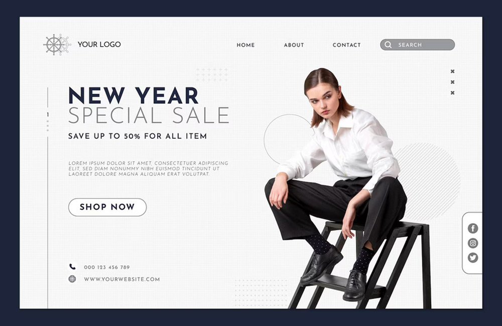
Image: freepik.com