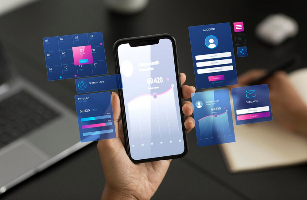
More and more users are accessing websites via smartphones. A good mobile UX is therefore crucial for retaining visitors, increasing conversions, and improving Google rankings. Mobile optimization isn’t just about responsive design—it’s about load times, intuitive navigation, easily readable content, and touch-friendly interactions. If you optimize your website only for desktop, you risk losing your mobile audience. A mobile-optimized site shows that you put the user first—and Google rewards that, too.
Why Mobile UX Is So Important
- User-friendliness: Mobile visitors expect fast load times and easy navigation. A poorly optimized site often leads to a bounce within just a few seconds.
- Search engine optimization: Google evaluates mobile versions of websites for ranking (“Mobile-First Indexing”). Those who fail to keep up here lose valuable visibility.
- Conversion: A poor mobile UX leads to high bounce rates and fewer sales or inquiries. Especially in e-commerce, every second determines whether a purchase is made or abandoned.
- Brand Image: A professional, fast, and intuitive design boosts user trust. A clean mobile UX demonstrates quality and foresight—two crucial brand values.
In an era where over 70% of all internet traffic comes from mobile devices, a good mobile UX is no longer a “nice-to-have” but an absolute must. Users expect content to be readable without zooming or horizontal scrolling. Any friction in the mobile experience acts as an invisible barrier—and the competition is just a tap away.
Tips for an Optimal Mobile UX
1. Use responsive design
Responsive design ensures that your website adapts flexibly to all screen sizes. With flexible layouts, images, and media queries, the design remains harmonious on every device. Make sure that no elements overlap or text gets cut off. Regularly test your site with tools like Google’s Mobile-Friendly Test to ensure it’s truly optimized for mobile.
2. Optimize load times
On mobile devices, speed is everything. Slow load times mean lost users. Compress images using tools like TinyPNG or Squoosh, reduce unnecessary scripts, and use caching as well as Content Delivery Networks (CDNs). Remember: Every millisecond counts, especially on mobile networks with weaker connections.
3. Simplify navigation
Intuitive navigation is the backbone of mobile UX. Hamburger menus, sticky navigation bars, or bottom tabs are ideal solutions for keeping user guidance clear and organized. It’s important that users never have to think about where to click—every click must be self-explanatory.
4. Improve readability
Good typography is crucial for mobile users. Choose clear fonts, sufficient line spacing, and high-contrast colors. Text should not be too close to the edge—white space improves readability. A minimum of 16px for body text is considered the standard for mobile devices.
5. Customize Call-to-Actions
Buttons are the bridge to conversion. They should be large, clearly labeled, and easily accessible—especially within thumb reach. Important actions such as “Request Now” or “Go to Store” must never end up in hard-to-reach areas. Also pay attention to contrast and animation to intuitively encourage clicks.
6. Touch Optimization
Mobile design also means: Avoiding input errors. Ensure there is sufficient spacing between clickable elements (at least 48px). Forms should feature large fields, automatic keyboard suggestions, and clear error messages. The smoother the interaction, the higher the conversion rate.
7. Think mobile-first
The “mobile-first” principle means designing content for small screens first. This automatically helps you focus on what’s essential and avoid information overload. A clear information hierarchy ensures that users immediately see what matters—without distractions.
Common Mobile UX Mistakes
- Buttons or links that are too small
- Long load times due to large images or scripts
- Difficult navigation or cluttered menus
- Text that gets cut off on small screens
- Pop-ups or banners that block the content
Many of these mistakes occur because designers still think in terms of the desktop. Mobile UX requires a different mindset: focus, clarity, and speed. Less is more—and that creates a greater impact.
Conclusion
A well-thought-out mobile UX is crucial for retaining users, increasing conversions, and securing SEO benefits. At aurelix, I combine modern web design with optimized mobile UX to ensure your website works on every device, loads quickly, and delights users. I’ll help you refine your digital experience—making it intuitive, engaging, and technically flawless.
Image: freepik.com