Well-designed navigation is crucial for your website’s user-friendliness. It helps visitors find content quickly, reduces frustration, and increases the likelihood that users will stay on the site longer.
Why Navigation Is So Important
- Quick Access: Users should be able to reach content without detours.
- Structure & Clarity: Clear menu items provide orientation.
- Increased Conversion: Visitors find offers or CTAs faster.
- SEO Benefits: Well-structured menus support search engine indexing.
Best Practices for Perfect Navigation
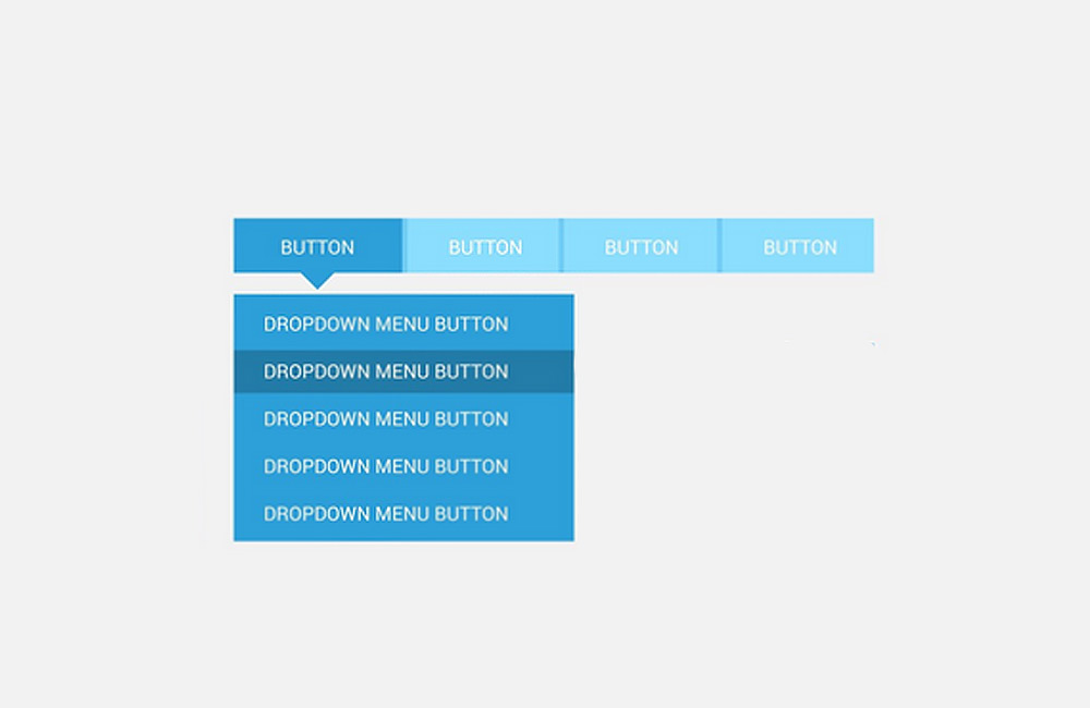
1. Simple Menu Structure
A maximum of 5–7 main items ensures clarity. Use submenus only if they are structured logically and sensibly.
2. Consistency Across All Pages
The menu should be positioned and designed the same way on all subpages so that users don’t feel lost.
3. Mobile-First & Responsive Design
Navigation should be easy to use on smartphones and tablets—for example, via a hamburger menu or a dropdown that’s easy to tap.
4. Visual Highlighting
Current pages, CTAs, or important menu items should be visually highlighted, e.g., through color, underlining, or icons.
5. Integrate a Search Function
On large websites, a visible search bar makes it easier to access content and improves the user experience.
6. Conduct User Testing
Navigation should be tested regularly to ensure that users can quickly find what they’re looking for without assistance.
Conclusion
Perfect navigation combines clarity, ease of use, and visual simplicity. It is the key to a positive user experience and also supports SEO goals. At aurelix, I make sure that navigation and content work seamlessly together so that visitors can quickly find what they’re looking for and stay on the website longer.
Image: freepik.com (adapted)