Minimalist web design is more than just a trend—it’s a philosophy that prioritizes clarity, simplicity, and user-friendliness. By focusing on the essentials, content, messages, and interactions become more understandable and engaging for users.
The Principles of Minimalist Design
- Clarity: Fewer distractions mean users can immediately recognize what the page is about.
- Simplicity: Reduce unnecessary elements, animations, and colors to the essentials.
- Focus on content: Text, images, and calls to action are clearly front and center.
- Whitespace: Sufficient space between elements ensures better readability and a more serene user experience.
- Intuitive navigation: A clear structure without superfluous menu items makes it easier to find your way around.
Advantages of minimalist websites
- Greater user-friendliness thanks to a clear layout.
- Faster loading times, since fewer resources need to be loaded.
- Greater focus on core messages and conversion goals.
- A modern, professional look that builds trust.
Tips for implementation
- Use a clear color scheme with a maximum of 2–3 primary colors.
- Choose modern, highly legible fonts and adjust font sizes to suit your target audience.
- Use whitespace strategically to separate elements from one another.
- Eliminate unnecessary images, animations, and widgets.
- Focus the navigation on the most important areas without overloading the page.
Conclusion
Minimalist web design demonstrates that less is often more. Clear structures, minimal elements, and a focus on essential content result in a website that appeals to users, loads faster, and facilitates the desired actions. At aurelix, I combine minimalist design with functionality to create modern, appealing, and effective websites.
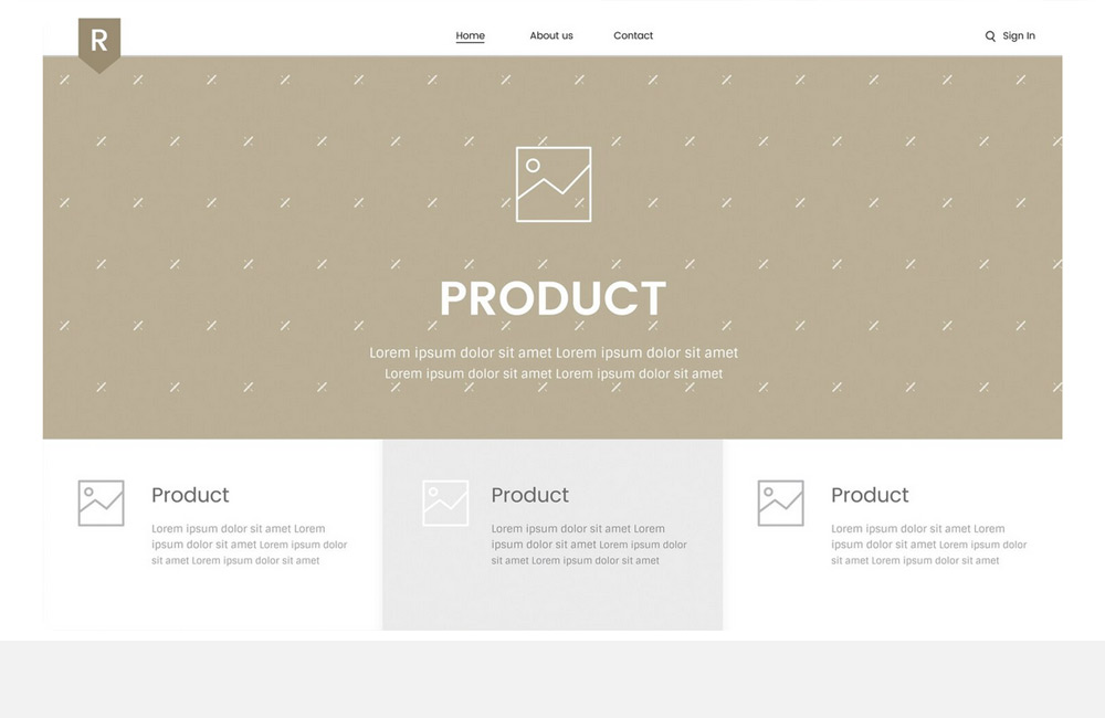
Image: freepik.com
Share this post