Pop-ups are among the most controversial elements in modern web design. They can grab attention, generate leads, and boost conversions—or have exactly the opposite effect. Too many or poorly placed pop-ups are considered one of the most common causes of high bounce rates and negative user experiences. Anyone who bombards visitors with constant pop-ups is signaling: This is about pressure, not trust.
1. Why Too Many Pop-ups Are Counterproductive
People visit websites with a clear intention—they want to find information, inspiration, or a specific product. If this natural flow of reading is constantly interrupted by pop-ups, frustration sets in. Pop-ups that appear as soon as the page loads—before the actual content is even visible—are particularly disruptive. The user feels interrupted before they’ve even had a chance to decide whether the offer interests them.
Even multiple pop-ups in quick succession—such as for newsletters, cookies, discount promotions, and push notifications—feel like an onslaught. The visitor loses patience, clicks the “X” in annoyance or leaves the page entirely. Studies show that too many pop-ups can reduce trust in the brand by up to 30% because they come across as manipulative. When users feel they’re being controlled rather than making their own decisions, acceptance drops dramatically.
2. When Pop-ups Are Useful and Effective
However, pop-ups can be a valuable tool—provided they are used in a targeted, respectful manner and offer genuine added value. So-called exit-intent pop-ups are particularly popular. They only appear when the mouse pointer leaves the top edge of the screen—that is, the moment the visitor is about to close the page. This makes them seem less intrusive and allows them to seize the last chance to maintain the visitor’s interest.
Such a pop-up could, for example, offer a free e-book, a discount code, or an invitation to subscribe to the newsletter. It’s important that the content is relevant and aligns seamlessly with the user’s interests. For example, someone who is currently reading an article about health is much more likely to respond to a pop-up offering a “Free Detox Guide” than to general advertising. Relevance is the key, not aggressiveness.
3. Timing, Design, and Psychology
A good pop-up respects the user’s time and attention. It appears only when the user has enough context to understand the offer—usually after 30–60 seconds or after scrolling a certain portion of the page. This way, it’s perceived as part of the experience, not as an interruption. The design should be clear, unobtrusive, and trustworthy: no garish colors, no exaggerated animations, no threatening phrasing (“Don’t miss this!”).
The psychological tone is also crucial: phrasing like “Stay informed” or “Get your gift” triggers positive emotions, while pressure (“Last chance!”) creates resistance. Visitors want to feel like they’re acting of their own free will, not being persuaded. That’s why every pop-up should be easy to close and clearly show how to proceed. Voluntary action builds trust—coercion destroys it.
4. How to Properly Test and Optimize Pop-ups
No pop-up works equally well everywhere. What works on a sales page can be off-putting on a blog. Use A/B testing to compare different variations : timing, wording, placement, and design. Tools like Google Optimize or Hotjar show how users actually react. Analyze bounce rates and conversion data to determine which variation provides real added value.
The same rule applies here: quality over quantity. One or two targeted pop-ups that offer real value are more effective than five poorly tailored windows. Pop-ups that are context-sensitive are particularly successful—for example, when they respond to the content of the article or the user’s behavior. Users who show interest while scrolling can receive an invitation; those who only linger briefly should be left undisturbed.
5. When Pop-ups Are Really Worth It
Pop-ups are worth it when they strike the right balance between information, relevance, and timing. On an e-commerce site, a well-placed pop-up offering a limited-time discount can make the purchase decision easier. On a blog, however, a subtle pop-up offering a newsletter subscription can build valuable engagement. The key is that the pop-up supports the user, not interrupts them.
Exit-intent pop-ups are often the most effective because they appear exactly when the visitor is about to leave the page anyway—meaning there’s no longer any risk of disturbing them. Here, a final nudge like “Would you like to take our free guide with you?” can work wonders. At that moment, the user feels respected, not pressured.
6. Conclusion
Pop-ups are neither good nor bad—their impact depends entirely on how thoughtfully and user-centrically they are used. Too many poorly timed pop-ups drive visitors away and damage brand perception. But cleverly designed, context-sensitive pop-ups can increase engagement, foster trust, and drive valuable conversions. The art lies in striking a balance between visibility and restraint. Those who understand visitors, rather than trying to persuade them, gain more in the long run.
Three Rules for Good Pop-ups
- 1. Relevance: Only display when the content matches the user’s interests.
- 2. Timing: Only display after the user has interacted with the content.
- 3. Respect: Easy to close, no forced actions, no pressure.
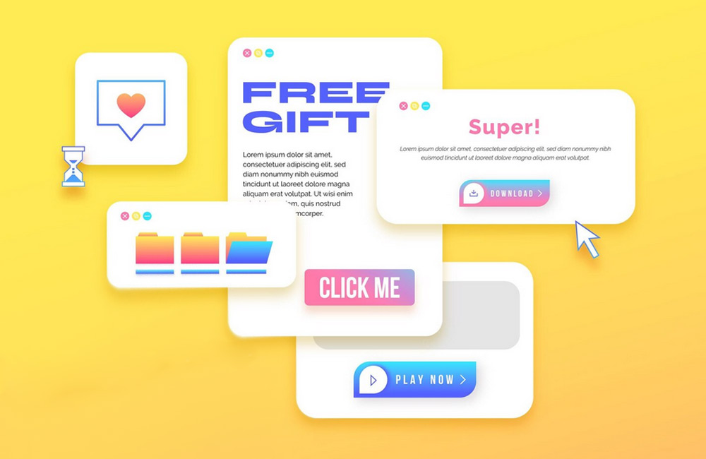
Image: freepik.com