Colors are far more than just a design element. They are an emotional language, an energetic vibration, and a central component of your brand identity. Even before anyone reads your name or understands what you offer, your brand’s color palette speaks directly to the subconscious.
Whether it’s a logo, website, or social media—the choice of colors helps determine how people perceive your brand. Colors can inspire trust, convey clarity, spark enthusiasm, or even—subconsciously—create distance. That’s why it’s important to choose them not only for aesthetic reasons, but also strategically and intuitively.
Colors have an impact on an emotional and psychological level
Every color carries specific symbolism and a unique frequency. In brand psychology, this effect is deliberately used to trigger desired emotions. Here’s a brief overview of the basic meanings:
- Blue: Trust, calm, reliability—often used by banks, technology, or healthcare brands.
- Green: Nature, balance, growth—ideal for sustainability, coaching, or holistic concepts.
- Red: Energy, passion, attention—strong but dominant. Use sparingly.
- Yellow: Optimism, creativity, zest for life—attractive, but can appear restless if overused.
- Black: Elegance, depth, clarity—particularly popular in the luxury and design sectors.
- White: Purity, openness, space – creates visual calm and lightness.
- Purple: Spirituality, intuition, transformation – often chosen by conscious brands or creatives.
Important: Meanings can vary by culture—and in the end, what always matters is what feels right for you and your brand.
Color Psychology in Branding
Colors shape the perception of a brand more than many people realize. According to studies, people make up to 90% of their spontaneous decisions about products and brands based solely on the effect of color. Your color palette is therefore the first impression of your brand’s energy.
A conscious choice of color strengthens brand identity. It combines visual aesthetics with emotional depth—and ensures that your brand is recognized and felt. This is especially crucial: It accompanies your brand permanently and should therefore appear timeless, clear, and harmonious.
Color Selection on Websites—More Than Just Design
Your website isn’t just about beauty, but about guidance and balance. Colors guide the eye, create structure, and influence how long visitors stay on your site . A design that’s too colorful or high-contrast can feel chaotic—while a page that’s too neutral can quickly seem boring.
The ideal approach is a harmonious combination of a primary color (your brand color), an accent color (for buttons and highlights), and neutral base colors (white, gray, beige, sand, black) that ground the design. This structure ensures brand recognition and a sense of calm.
Intuitive or strategic—ideally both
A strong brand emerges when strategy and intuition complement each other. Your color choices can stem from your inner brand energy: What vibe do you want to project? What should people feel when they visit your site or see your logo?
When you trust your intuition while also understanding the psychological impact, the result is an authentic visual language—a brand that is not only seen but felt.
Conclusion: Colors are vibration, emotion, and strategy all at once. They are the invisible link between your inner vision and external perception. Choose them consciously, lovingly, and with the knowledge that they carry your message.
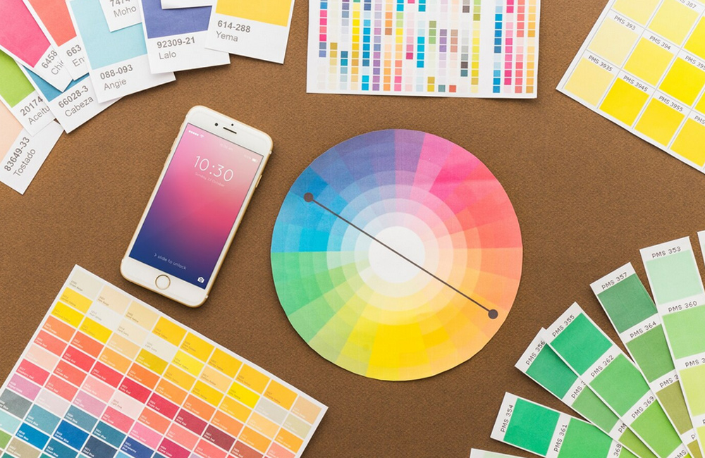
Image: freepik.com