Navigation is the heart of every website. It determines how users discover content, absorb information, and ultimately decide whether to stay on your site or leave. Creative navigation can be more than just functional; it can also strengthen brand identity and create a unique user experience. Good navigation acts like an invisible guide—it guides without forcing and inspires without overwhelming. It often determines whether someone clicks further or leaves the page. After all, navigation is far more than just a menu—it’s a sense of orientation, trust, and ease.
Why Creative Navigation Is Important
- User Guidance: Intuitive navigation helps visitors quickly find what they’re looking for.
- Brand Image: A unique menu can convey the brand’s personality.
- Time Spent on Site: Users stay longer when the navigation piques their curiosity and invites exploration.
- Conversion: Clearly placed menu items and calls to action lead to higher conversion rates.
Creative navigation isn’t a luxury—it’s a strategy. It influences how users think, feel, and act. A well-designed menu structure instills trust, sparks curiosity, and provides orientation. When design and function merge, a flow emerges that guides visitors through your content in an almost playful way. And it is precisely this flow that leads to longer dwell times, more clicks, and ultimately better conversion rates. At Aurelix, we call this "aesthetic guidance with depth."
Tips for Creative Navigation
1. Use Visual Hierarchy
Important menu items should stand out, e.g., through size, color, or position. Submenus can be displayed subtly to maintain clarity. Make sure users immediately recognize where they are—a clear visual anchor prevents disorientation. A consistent design system (e.g., the same colors for active elements) builds trust and conveys professionalism. Structure is beauty in order. A clear hierarchy is like a quiet voice telling the visitor, "You’re in the right place."
2. Incorporate interactive effects
Hover effects, microanimations, and subtle movements bring navigation to life without overloading it. Small reactions to user interaction—such as color changes, slide-ins, or shadows—create an emotional connection. Movement draws attention and conveys a sense of modernity, but it should always remain functional. Less is often more here: smooth transitions instead of garish distractions. When you use interactivity sparingly and wisely, navigation feels natural, playful, and high-quality.
3. Storytelling in Menus
Menu items can tell stories or guide the user on a journey through your content. Examples: "Our Story," "Discover Projects," or "Behind the Scenes." Storytelling creates a connection—the user feels emotionally engaged. Good menu navigation sparks curiosity and invites users to keep reading. This way, even a simple click becomes a moment of discovery. Navigation can be magical—when it makes sense.
4. Off-Canvas and Hidden Menus
Hidden or drop-down menus save space and create a minimalist design—especially on mobile devices. They help draw attention to the content without cluttering the overall layout. To keep these menus intuitive, they should be easy to find and well-animated. Icons like the classic "hamburger menu" have long been standard, but you can personalize them with animation or text labels. Minimalism here doesn’t mean less content, but rather more focus.
5. Creative Icons and Illustrations
Symbols, illustrations, or small animations can visually support menu items and simplify user guidance. An icon often replaces entire words and creates universal understanding—regardless of language. Custom-illustrated elements give your navigation character and make it instantly recognizable. But make sure that aesthetics and function harmonize. Icons should not only look good but also communicate clearly. This way, every symbol becomes part of your brand voice.
6. Sticky Navigation
A fixed menu bar makes navigation easier on long pages and improves usability. Users never lose their bearings—the menu is always within reach. This technique is particularly helpful for landing pages or scroll stories. A subtle, slightly transparent sticky menu looks elegant and unobtrusive. Continuity builds trust: When the menu stays in place, users feel confidently guided. A small technical trick—with a big impact on the user experience.
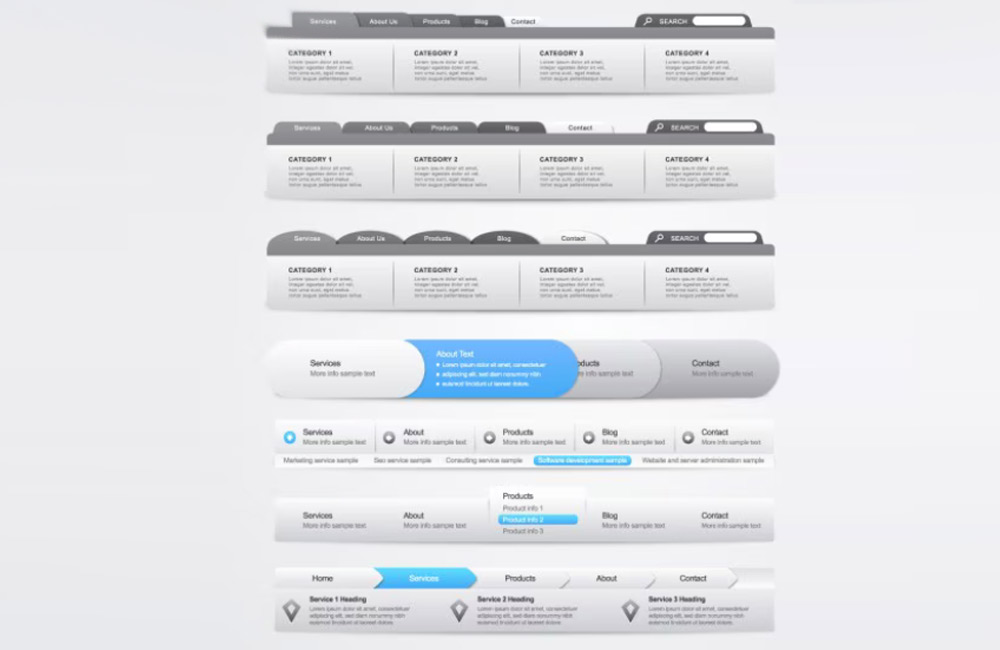
Examples of creative navigation
- Vertical menus with animated sub-items
- Megamenus with image and icon support
- Interactive scroll navigation that links to specific sections
- Hidden menus that appear only on click or hover
Creative navigation doesn’t mean complicated navigation. Any of these variations can work as long as they remain intuitive and offer added value. Experiment with layouts, but stick to the golden rule: Design follows function. When users enjoy interacting with your site, they’ll have a positive impression—and that strengthens your brand in the long run. Find inspiration in modern design galleries or interactive web projects that combine emotion with clarity.
Mistakes You Should Avoid
- Overly complicated menus that confuse users
- Too many sub-levels that make it hard to navigate
- Creative ideas without clear benefits or user guidance
- Non-responsive navigation for mobile devices
Navigation errors act like stumbling blocks on the path through your website. Avoid anything that forces the user to think about where to click. Navigation that’s too creative can quickly become frustrating if it disrupts orientation. Functionality always takes precedence over design experimentation. And don’t forget: Navigation that doesn’t work on mobile devices loses over half of potential visitors. Simple paths lead to the best destinations.
Conclusion
Creative navigation can significantly improve the user experience, strengthen brand identity, and increase dwell time. The key is that it always remains functional and guides the user rather than confusing them. At Aurelix, I combine creativity and usability so that navigation not only looks good but also delivers results. Because good design doesn’t happen by chance—it’s the result of deliberate guidance. If you want visitors to stay, you have to make them feel at home—right from the very first click.
Because good design doesn't happen by chance—it's the result of deliberate guidance. If you want visitors to stay, you need to make them feel at home—right from the very first click.
Image: freepik.com