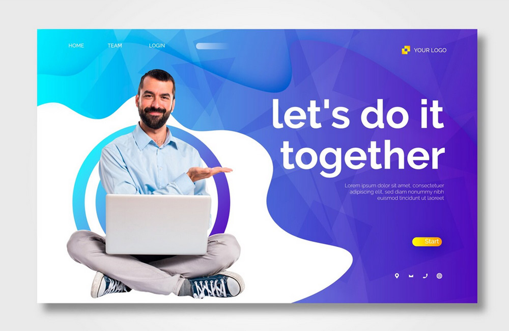
Landing pages are specially designed websites with a clear focus: to encourage visitors to take a specific action. Whether it’s signing up, making a purchase, or downloading something—the design and structure of a landing page are key to its success. A well-designed page intuitively guides the user through the content without overwhelming them with unnecessary distractions. It clearly communicates what’s being offered, why it’s relevant, and what action should be taken next.
Why Landing Pages Are So Important
- Focus: Unlike traditional websites, a landing page directs attention specifically toward a single goal. This reduces distractions and increases the likelihood that visitors will take the desired action.
- Conversion: A clearly structured page with compelling arguments, emotional elements, and a concise call-to-action (CTA) can significantly increase the conversion rate.
- Measurability: Landing pages allow for the targeted evaluation and optimization of campaigns, ads, or newsletter promotions. This makes them a key tool in online marketing.
- SEO & Ads: A landing page optimized for search engines and users improves the quality of Google Ads campaigns and ensures lower cost-per-click while increasing conversion rates.
Building a Successful Landing Page
1. Headline & Subheadline
The headline is the heart of every landing page. It determines within seconds whether the visitor stays or clicks away. A good headline appeals to emotions, addresses a need or makes a promise, and clearly communicates the benefit. The subheadline complements and expands on the main message, often with a brief explanation or a clear value proposition. Craft it so that the reader immediately understands: "This is exactly what I’m looking for."
2. Visuals
Images and videos speak directly to the subconscious. They make an offer tangible and emotionally engaging. Authentic photos or explanatory illustrations convey trust, while short videos make complex concepts quickly understandable. It’s important that the visual elements support the message—not distract from it. Clear, uncluttered imagery is often more persuasive than overloaded graphics.
3. Benefits & Advantages
Visitors want to know: What’s in it for me? Instead of merely describing features, the text should list specific benefits. Describe what problem is solved, how daily life is improved, or what results can be achieved. Bullet points are ideal for presenting these benefits clearly. Use emotional and motivating phrases such as "Save time," "Achieve more," or "Feel more secure."
4. Call to Action (CTA)
A clear CTA is the goal of every landing page. It should be clearly visible, highlighted in color, and worded in a way that’s easy to understand. Avoid vague terms like "Submit"—instead, use action-oriented phrases such as "Try it for free now" or "Get this offer." Repeat the CTA in several places on the page, especially after important sections of content. This increases the likelihood that visitors will take action.
5. Trust Signals
People buy from people they trust. So be sure to display testimonials, customer reviews, partner logos, or certifications. References to data protection and secure payment systems also build trust. Genuine testimonials or statistics ("Over 5,000 satisfied customers") are more effective than general statements. Trust is built through authenticity—show real people and actual projects.
6. Minimalist Structure
Less is more. A landing page should focus on the essentials and avoid all unnecessary distractions. Remove menus or external links that could lead visitors away. Each section should contribute to the goal—whether it’s providing information, evoking emotion, or prompting action. A clear visual hierarchy automatically guides the reader’s eye toward the desired action.
7. Optimization for Mobile & Performance
Over 60% of all visitors now come via mobile devices. A good landing page must therefore work perfectly on smartphones and tablets. Make sure to use large buttons, short load times, and clear text structures. A responsive design and fast server performance directly influence the conversion rate. Google also considers mobile usability an important ranking factor.
Tips for Conversion Optimization
- A/B Testing: Test different headlines, CTA texts, and colors to see what works best.
- Short forms: Reduce input fields to a minimum—the simpler, the higher the completion rate.
- Scarcity: Elements such as "valid only today" or countdown timers create a sense of urgency.
- Clear layout: Use colors strategically to draw attention to the CTA, and ensure there is sufficient white space.
- Build trust: Place reviews, guarantees, or security symbols near the CTA.
Mistakes to Avoid
- Too many navigation elements that distract from the goal
- Unclear messages or vague headlines
- Long load times or technically flawed displays
- Overloaded pages with too much text or too many visual effects
- Inconspicuous or inconsistent calls to action
Conclusion
Modern landing pages thrive on clarity, structure, and trust. They effortlessly guide visitors toward a decision—while delivering a positive user experience. By optimally aligning text, design, and technology, you can create a page that not only looks great but also works effectively. At aurelix, I combine design, strategy, and psychology to ensure your landing pages convert noticeably better.
Further Resources
Image: freepik.com