The structure of your homepage plays a decisive role in whether visitors stay longer, learn more, or become customers. A clear hierarchy, well-placed content, and intuitively designed navigation are crucial for capturing users’ attention and increasing their time on site. A good structure is like an invisible thread that guides visitors through your site from the very first second—without friction, without confusion. It ensures that people can intuitively find their way around, build trust, and engage more deeply with your content.
Why Homepage Structure Is Important
- First Impression: Visitors decide within seconds whether to stay or leave.
- User Guidance: Clear structures help users find content quickly.
- Conversion: A good structure guides visitors toward important actions such as contacting you, making a purchase, or signing up.
- SEO: A clear structure helps search engines index your content.
The structure of your website is therefore not just a design issue, but a strategic factor for success. Even the first impression influences whether trust is built or uncertainty arises. A well-structured homepage provides guidance by clearly communicating the "why," "what," and "how" of your offering. It appeals to the eye, the mind, and the emotions all at once. Google also views logical hierarchies positively, which strengthens your visibility in the long term.
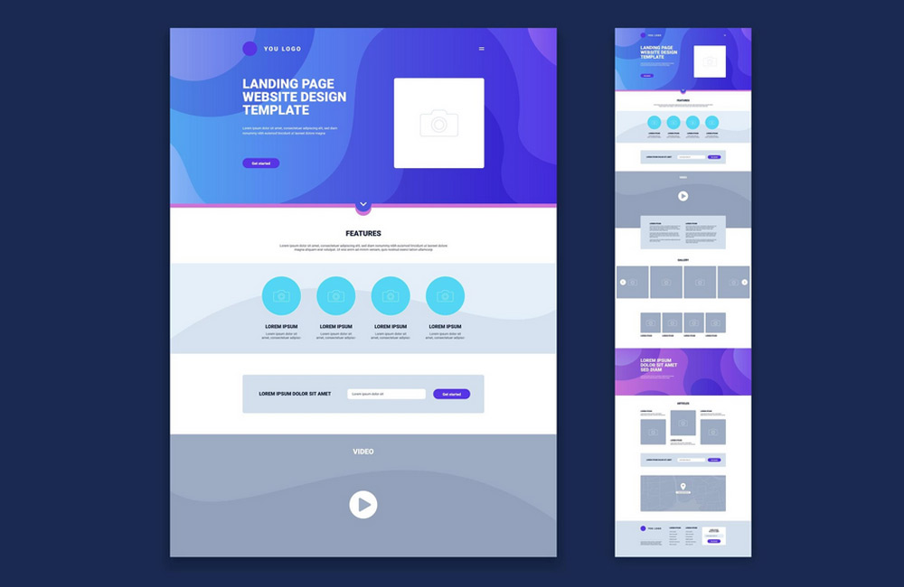
Best Practices for a Compelling Homepage
1. Clear Header with Key Information
The top section is your brand’s storefront. It should include your logo, navigation, and a concise core message. A clearly worded slogan or USP immediately shows what the site is about. Within seconds, visitors want to know: "Am I in the right place?" or "What’s in it for me?" The header is therefore your opportunity to build trust immediately and provide guidance. A call-to-action in the header, such as a button labeled "Contact Us Now" or "Learn More," can also significantly increase the conversion rate.
2. Visual hierarchy
Our eyes follow patterns—large, high-contrast elements attract attention first. A clear visual hierarchy ensures that important content is noticed immediately. Use colors, sizes, spacing, and typographic contrasts to guide the flow of reading. This helps visitors intuitively grasp what really matters. Especially important: Reduce visual clutter. Fewer competing elements lead to greater focus and a better user experience.
3. Organize Content Areas Logically
Structure your homepage into clear sections that follow a logical sequence—such as benefits, services, testimonials, and calls to action. Each section should have its own goal and be visually separated from the next. This creates a harmonious flow that guides the user. Use subheadings, icons, and harmonious color blocks to provide orientation. The clearer your structure, the longer visitors will stay on your site and the more likely they are to take action.
4. Simple and Intuitive Navigation
Navigation is the backbone of every website. Clear labels, flat menu hierarchies, and a clear structure help visitors find their way around quickly. Avoid cryptic terms or too many sub-items—they overwhelm users. A so-called "sticky menu," which remains visible while scrolling, also improves the user experience. Users should always know where they are and how to get back. Good navigation is like a compass—invisible, but indispensable.
5. Place calls to action prominently
A call-to-action (CTA) is the heart of your conversion strategy. Well-placed and clearly visible buttons guide visitors directly toward the desired action. Experiment with colors, text, and placement. Phrases like "Request a Quote Now" are more effective than generic phrases like "Learn More." Repeat CTAs at strategic points to lower decision barriers—but without overwhelming the user. A good rule of thumb: One goal per page.
6. Mobile Optimization
More than 70% of website visits now come from smartphones. Your site should therefore perform just as well on mobile devices as it does on desktop. Touch-friendly buttons, fast load times, and compact layouts are a must. Test your homepage regularly with tools like Google Mobile-Friendly Test. This will help you determine whether users have an equally good experience on the go. Mobile usability is no longer a nice-to-have—it’s the standard.
7. Incorporate trust elements
Trust is the currency of the internet. Testimonials, client logos, seals of approval, and reviews build credibility and lower the barrier to getting in touch. Show real people, photos of your team, or awards—they have a stronger impact than sterile icons. Social proof, such as Google reviews or testimonials, also builds trust. Combined with consistent design, this creates a professional overall impression that strengthens your brand.
Common Mistakes
- Cluttered homepage without a clear structure
- Important information placed too far down the page
- Unclear or hard-to-find navigation
- Missing calls to action or too many competing actions
- Not optimized for mobile devices
Many websites lose visitors because they try to show too much at once. An overloaded design creates stress and distracts from what’s essential. Unclear navigation can also drive visitors away within seconds. The trick is to make the essentials visible and the unimportant invisible. Less is often more—especially when every element serves a clear purpose.
Conclusion
A well-thought-out homepage structure is like a silent salesperson working for you around the clock. It improves the user experience, increases dwell time and conversion rates, and supports your SEO. At aurelix, I combine design, structure, and user guidance so that your homepage wins over visitors and delivers results. Invest in clarity—it’s the most elegant form of persuasion.
Image: freepik.com